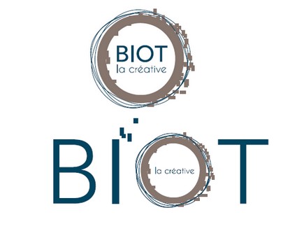
The City of Biot has just adopted a new visual identity. Serving a territorial project, this new identity encompasses values, strategy, and branding.
Today, the City of Biot asserts its unique character through a territorial project that capitalizes on its strengths: its creative wealth, preserved living environment, the Sophia Antipolis tech hub, its historical heritage, its contrasts, its talents, and its population.
Through this logo, which is simple, elegant, and in motion, combined with a tagline that embodies the very essence of the city, Biot develops a dynamic, creative, and innovative image, an extraordinary image that all stakeholders in the city can embrace (residents, new residents, associations, artists, merchants).
A few explanations…
Blue symbolizes calm, wisdom, and freedom. Like the Mediterranean Sea that opens up horizons…
Brown, the color of the earth par excellence, is soft, reassuring, and almost maternal. Brown is also linked to clay, silica, or firestone used for generations by the artisans of Biot.
The “sans-serif” typography conveys power and precision. The use of capital letters gives Biot the stature of a city.
The circle envelops. The circle protects. The circle represents the world and its movement. The hypnotic roundness created by Biot the creative.


